Buckminster Fuller's dymaxion map of the world
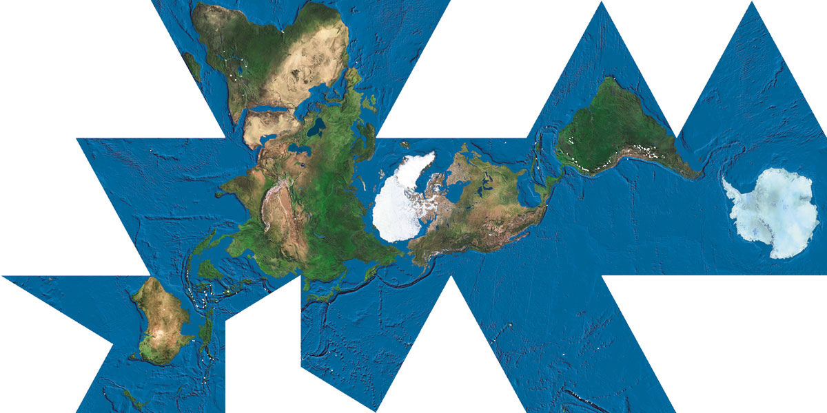
Buckminster Fuller was obsessed with this word “dymaxion” which I think was supposed to be a combination of “dynamic” and “maximum”. He created this “dymaxion map” of the world which was intended to have the least possible distortion of the shape of the land features. Have a good look at it.
One thing that’s interesting about it I think is that Africa is really much bigger than North America. The “usual” map projection (Mercator) is really terrible because it totally accentuates the size of land masses that are close to the poles. So that N.A., Europe, and Australia are all way too big. Here you can see the truth.
Another interesting discovery for me is the small size of India. I always thought that India was a bit bigger than that. The arctic is also rather small. The Himalaya is very prominent. And I like the curving shape of the islands from Alaska down the eastern side of Asia.
You can also see how the continents all seem to almost be connected into one big island surrounded by water.
The funny shape of the map is because it’s designed to be folded up into a roughly spherical shape. Here’s an amazing animation of the dymaxion map folding and unfolding .
And here’s the Buckminster Fuller FAQ .